
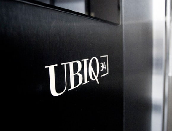
Our two logotypes
in one place
ABOUT THE PROJECT
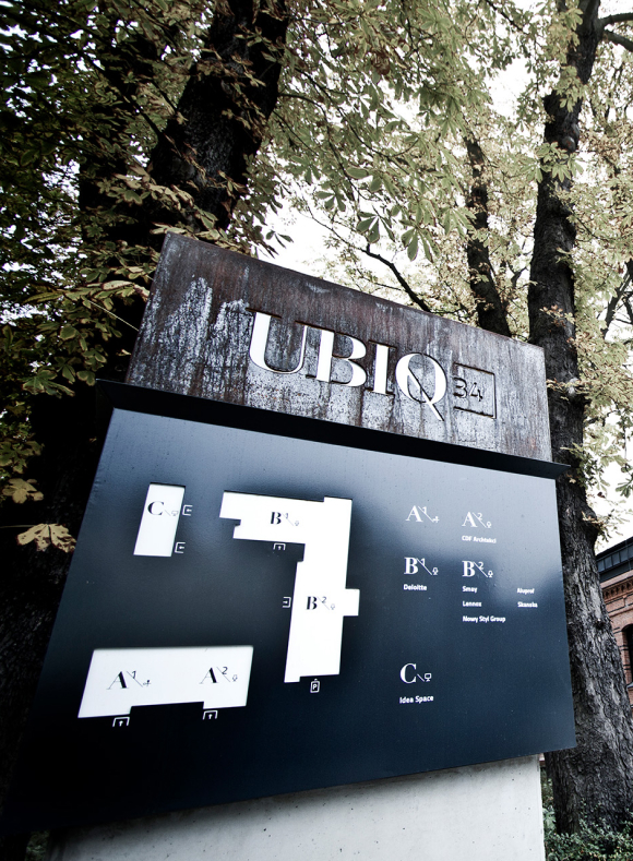
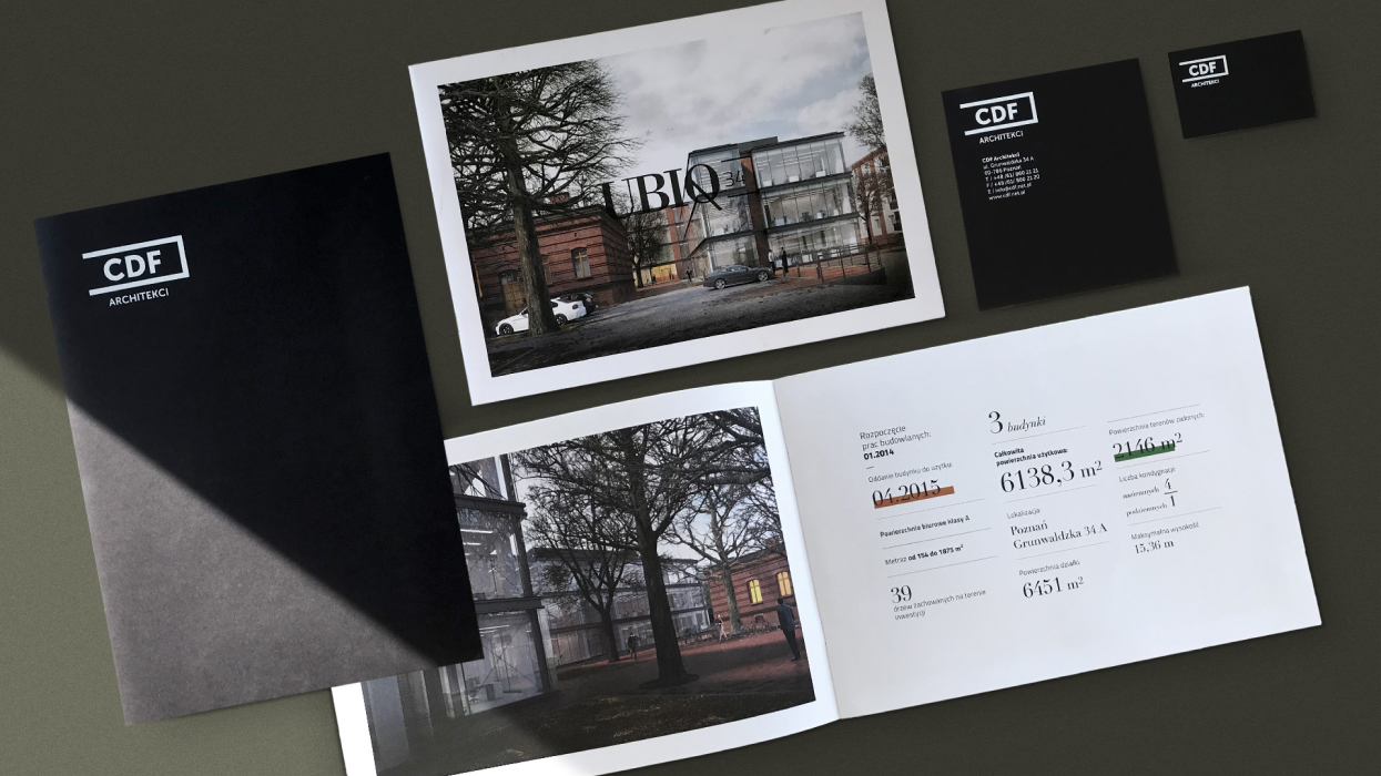
We immediately liked the investment in the former barracks of the 15th Poznań Uhlans Regiment, and not only because it is located in our close vicinity. UBIQ 34 is a complex of three office and service buildings with a unique character. This is because of the skilful combination of historical buildings with elements of contemporary architecture and technology. The design office of CDF Architekci (whose logotype we also designed), asked us for help in creating a logo, image materials and a visual identification system for its latest investment.
CLIENT
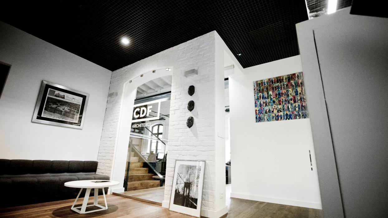
CDF Architekci
SCOPE
Logo, branding, brand book, visual identity, information system, wayfinding
WHEN
2016
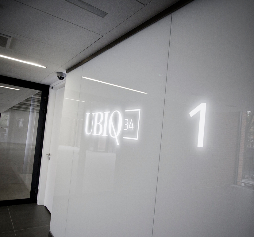
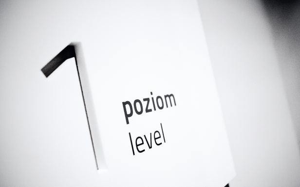
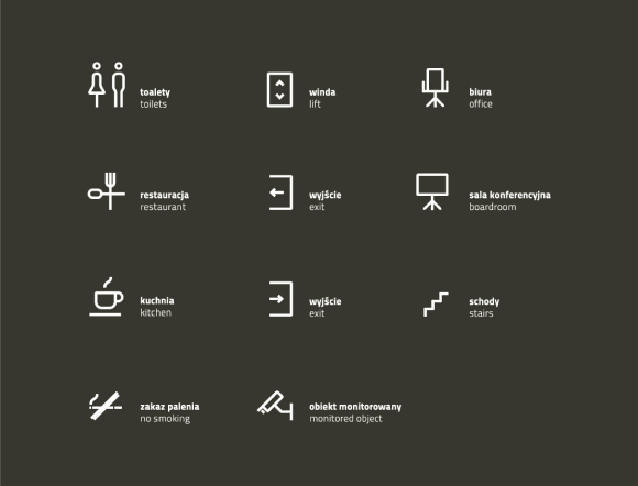
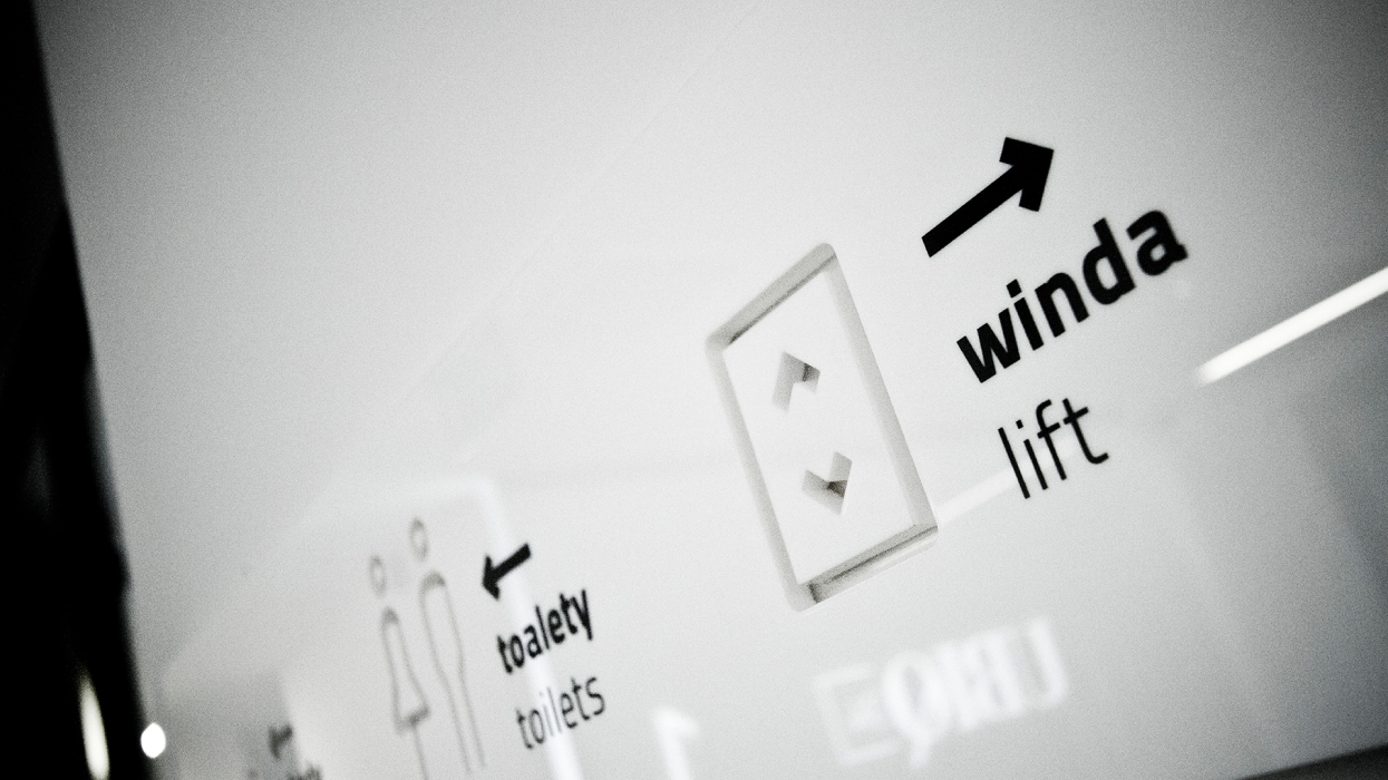
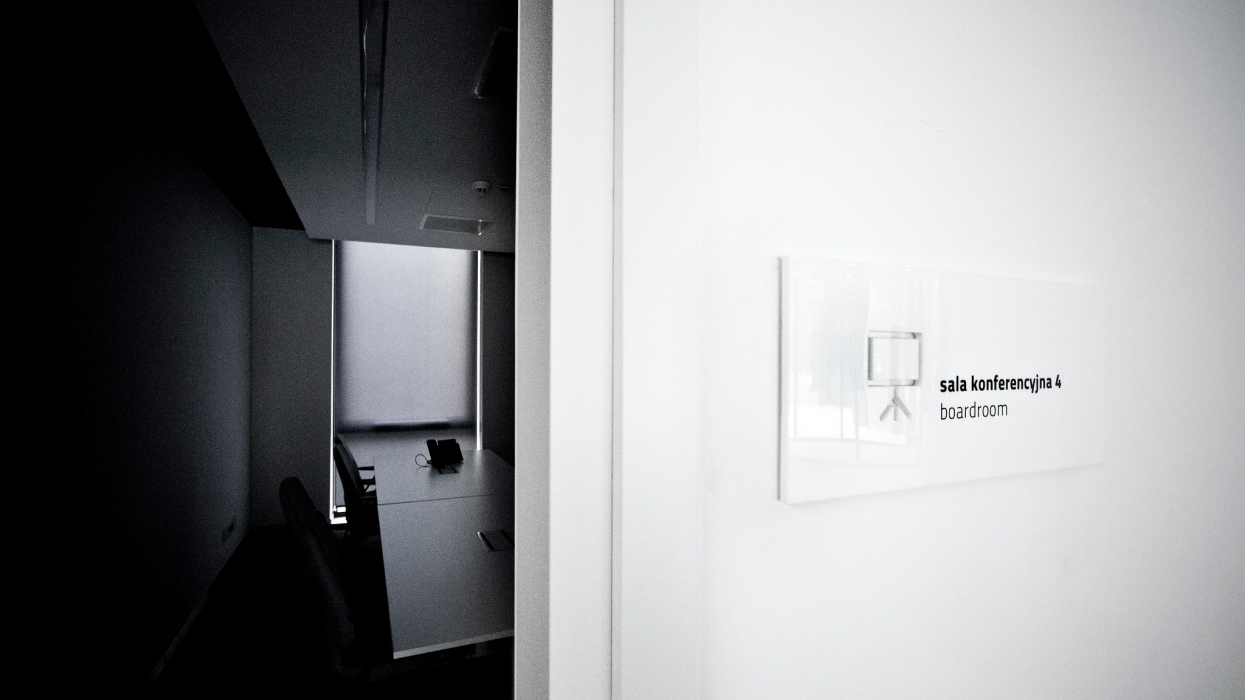
INFORMATION SYSTEM
We were responsible for both the design and comprehensive implementation of the Visual Identification System solutions proposed by us. We planned the identification in the same way as the entire investment – by consistently combining tradition with modernity. Before the production of individual materials and their assembly, we prepared prototypes of the system to tangibly check which of them would best match the architectural assumptions of the Investor.
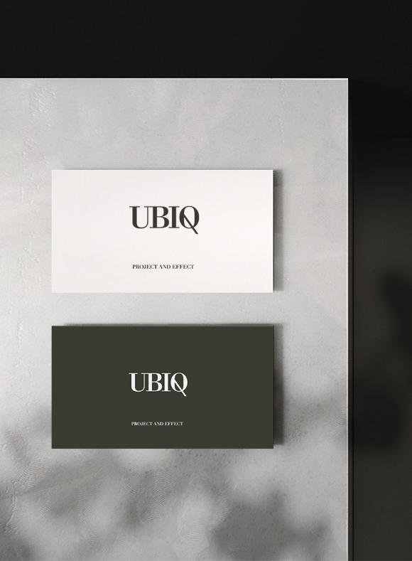
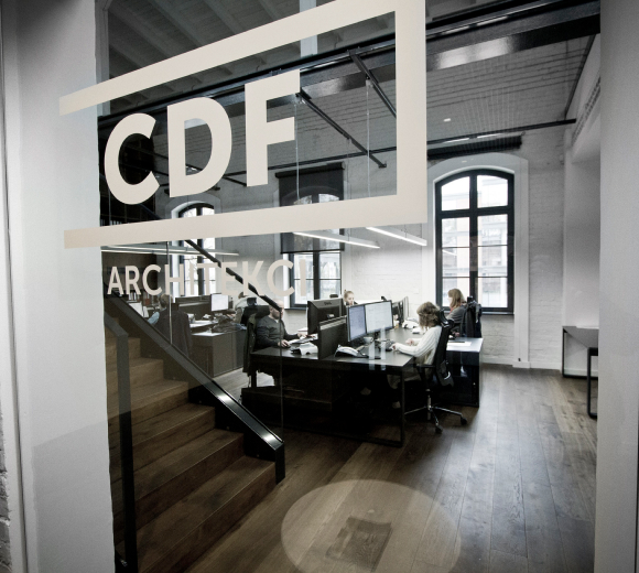
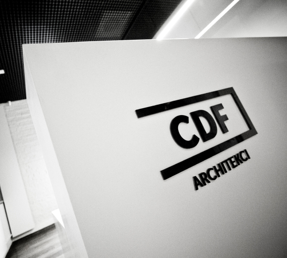
CDF ARCHITEKCI LOGOTYPE RESTYLING
While we were designing the logo for UBIQ 34 and CDF Architekci were opening their new office there, we also proposed to restyle their logotype. We focused on simplicity and transparency. Its form perfectly matched the expectations of the Client and the atmosphere of the new office, which other architects can only envy.

-
See other projects
- All projects

